Currently, there is no one location that acts as a “guide” to Nashville. These kiosks will become this guide, pairing with a coordinated smartphone app to allow for a seamless user experience. By providing a customized guide to the city that utilizes it’s functionality to be revenue-driven, navigating Nashville will be brought into the 21st century, modernized through it’s focus on how both visitors and locals are interacting with it.
Research
A competitive analysis was conducted for both the kiosk and smartphone application designs. Remote, moderated interviews via Zoom were also held to gauge a better understanding on if kiosks and a smartphone guidance application would truly benefit the Nashville community.
Application Competitive Analysis
Application Discovery Interview Test Plan & Research Report
Physical Kiosk Design
The evolution of sketches to the final kiosk design.
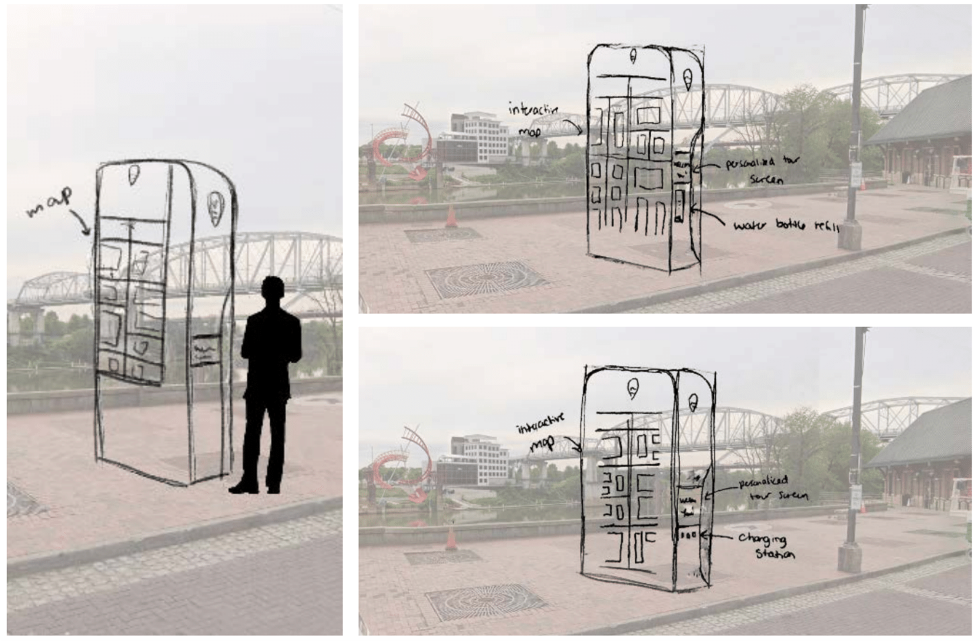

Featuring a wide, secure base with a cutout near the bottom that’s illuminated by LED lights, the kiosk will provide stability while maintaining the safety associated with visibility.
Kiosk Interface
Keeping in mind ADA compliance guidelines, possible kiosk interface wireframes were drafted.
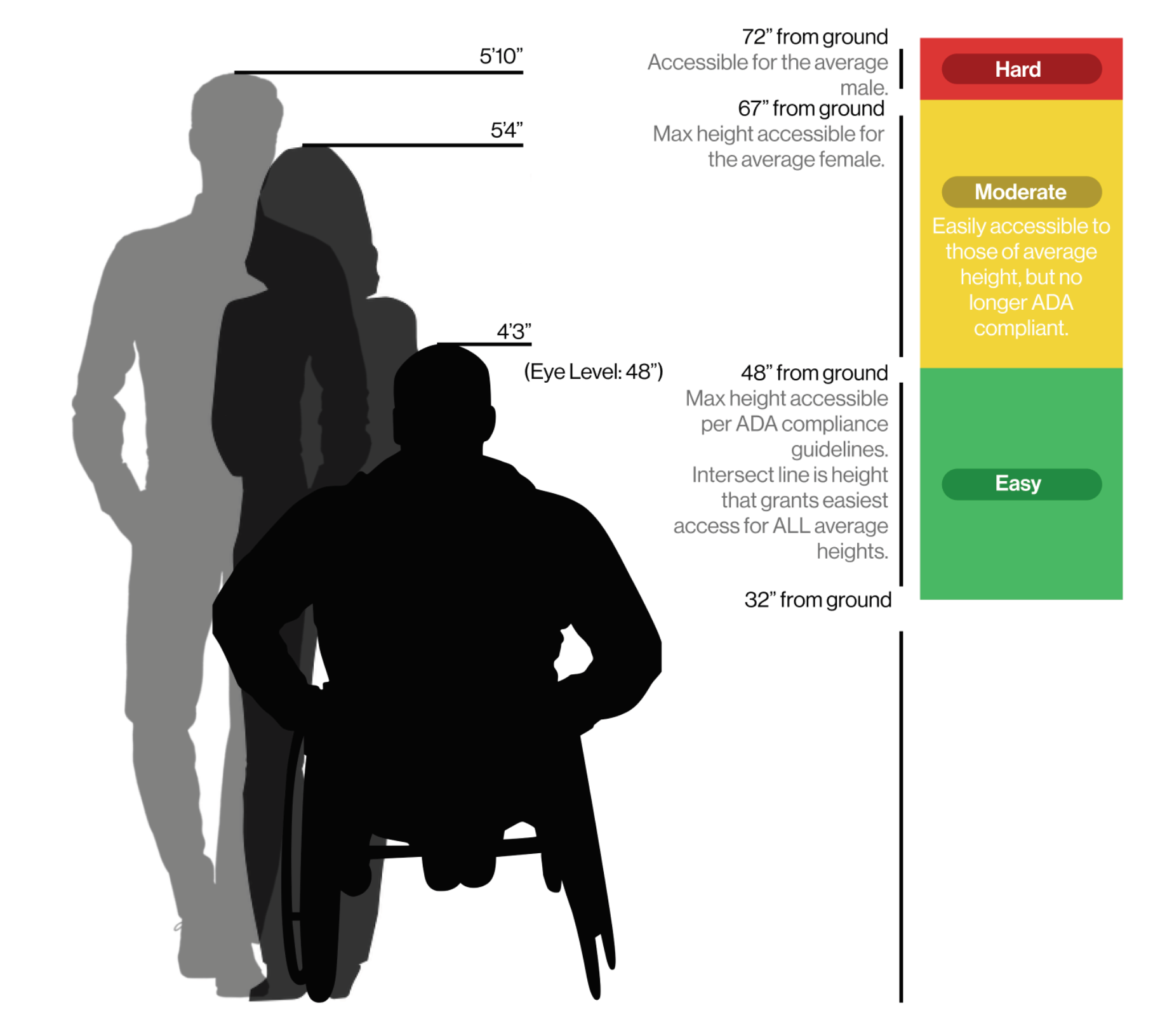
Mapped ADA compliance guidelines
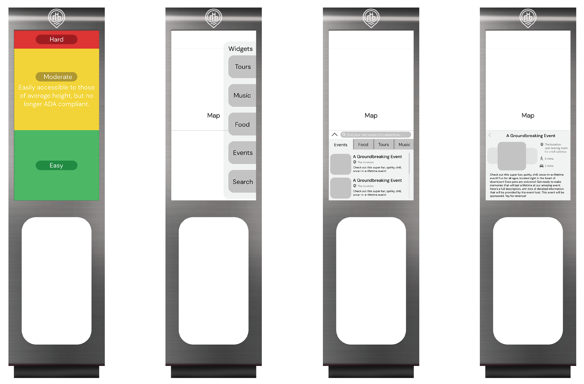
Wireframes compared to ADA compliance guidelines
Once the most functional and accessible wireframe was created, drafts of the interface design were refined before landing on the final kiosk interface design.
Initial kiosk interface drafts
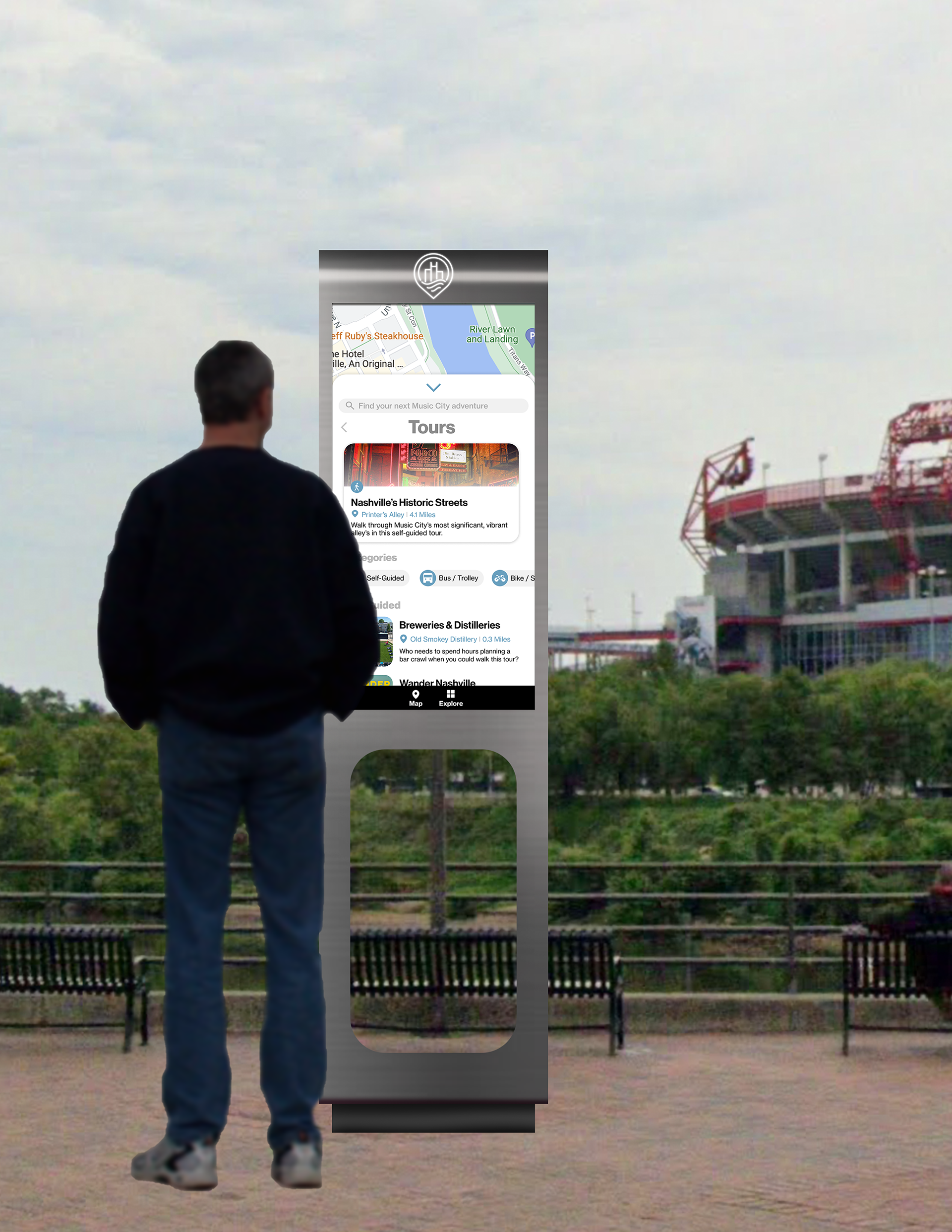
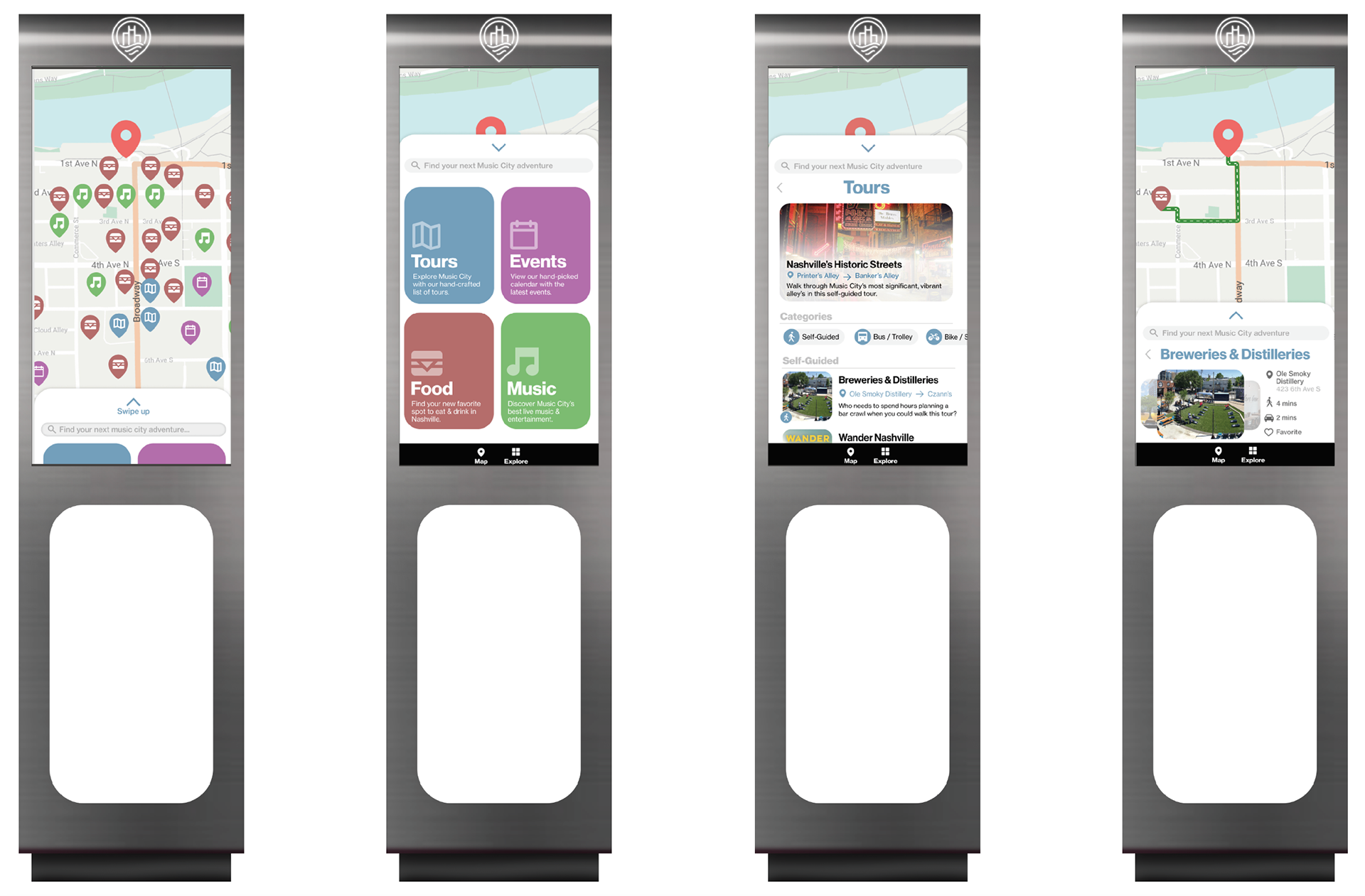
With accessibility being at the forefront of the interface design, the kiosk features an adjustable height that can be raised whatever height is most comfortable for the user. When not in use, the kiosk will act as a map. A pop-up “explore” page is motion-activated, and will feature “tours,” “events,” “food,” and “music.”
The larger screen will provide revenue-based information, so all specific events will be ranked by revenue. For the sake of privacy, the only information that has the opportunity to be gathered on the larger screen is an email.
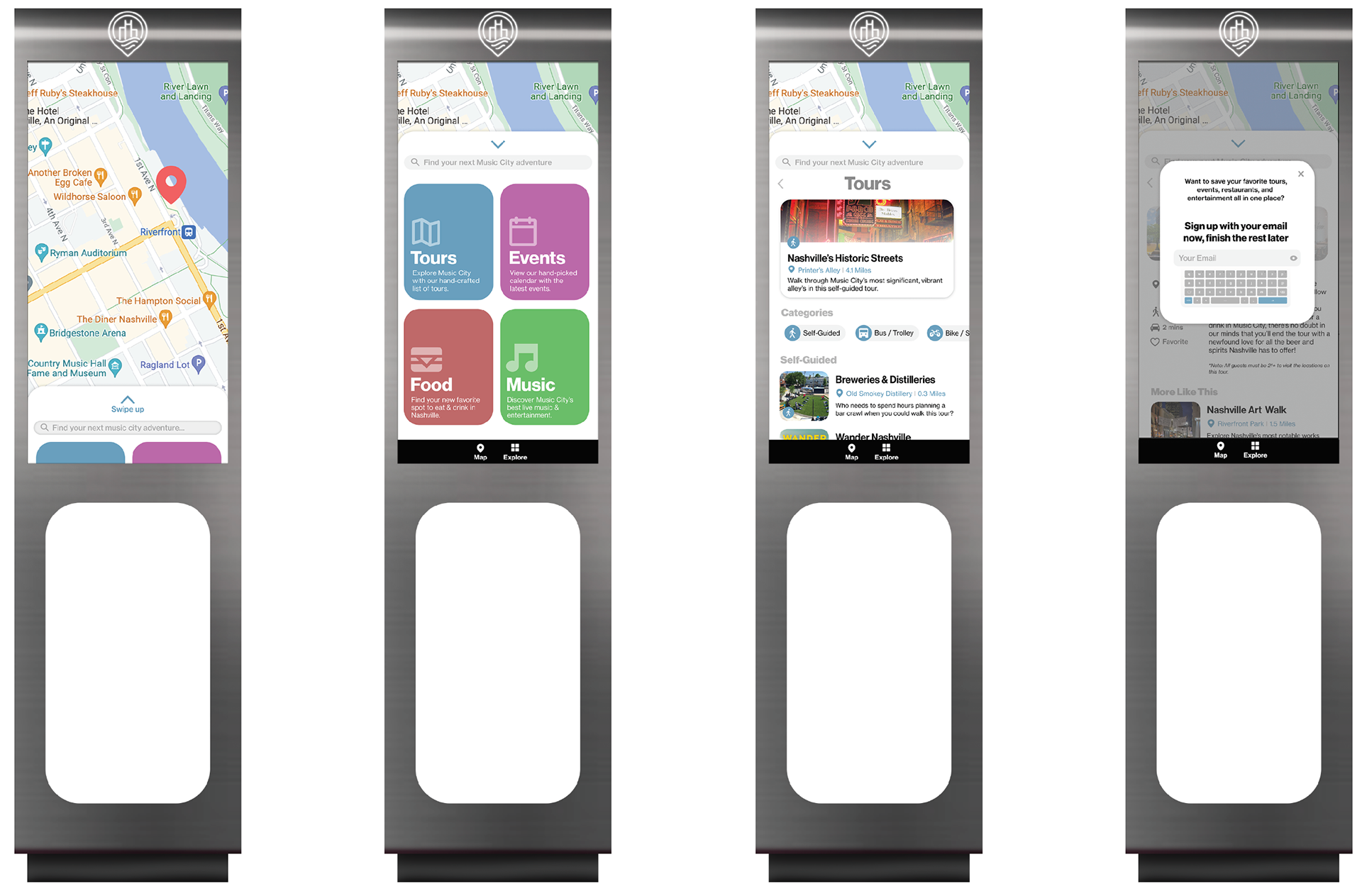
Final kiosk interface design
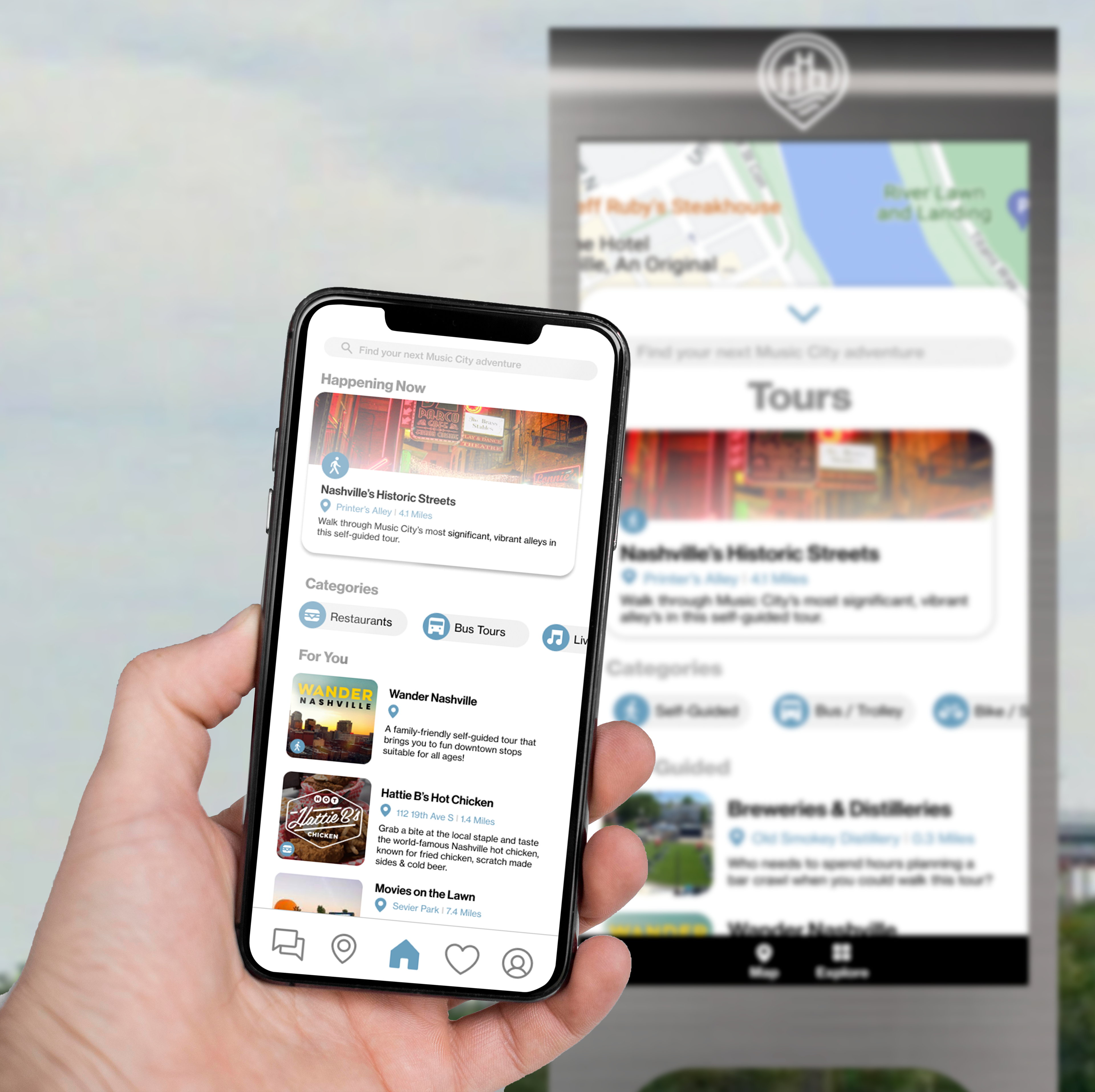
Application Design
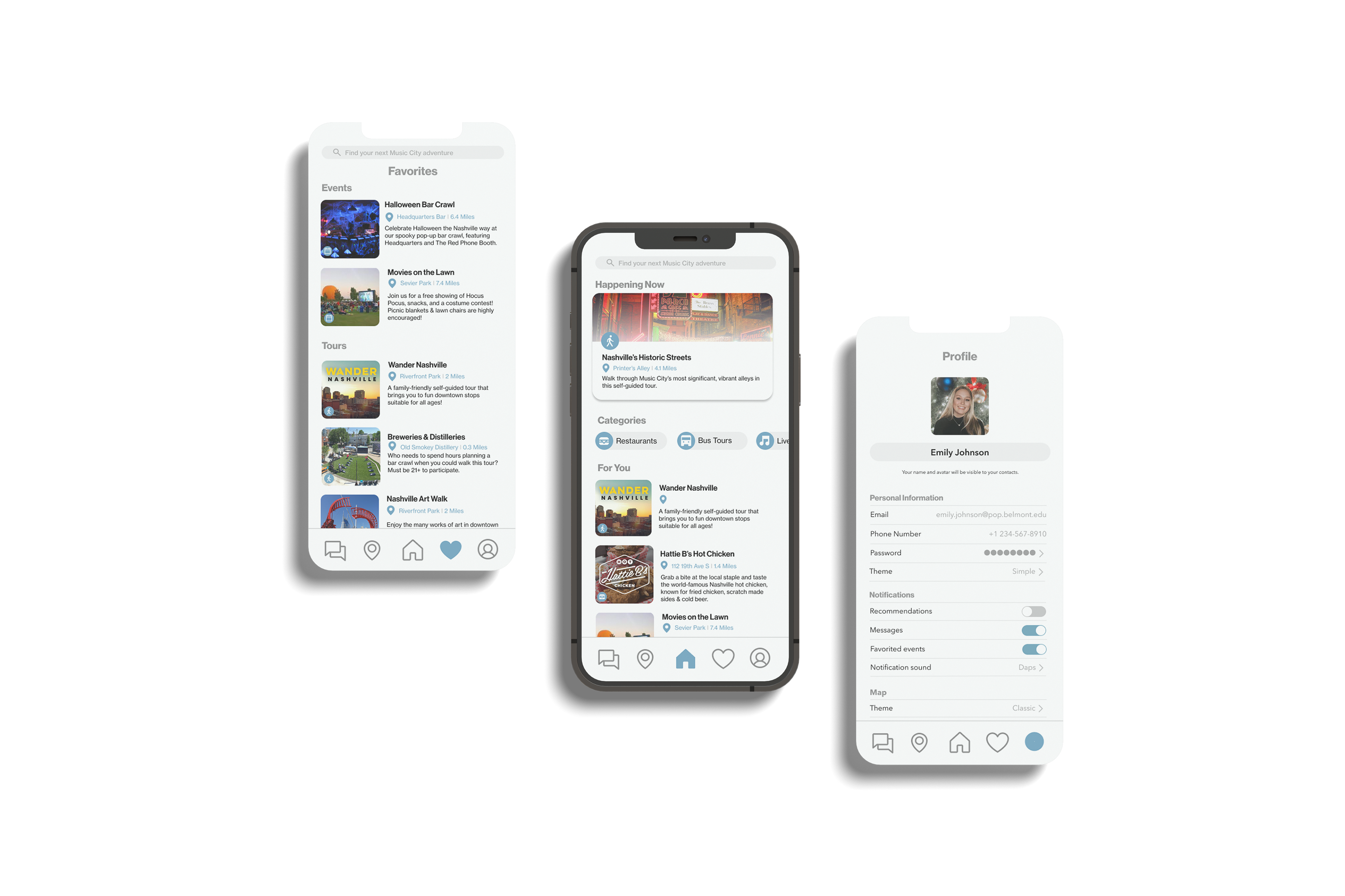
On the home page (middle), the user is presented with trending and promoted events and locations, which can be explored in categories. The favorites page (left) features locations and events the user has “liked.” The profile page (right) serves as a settings page.
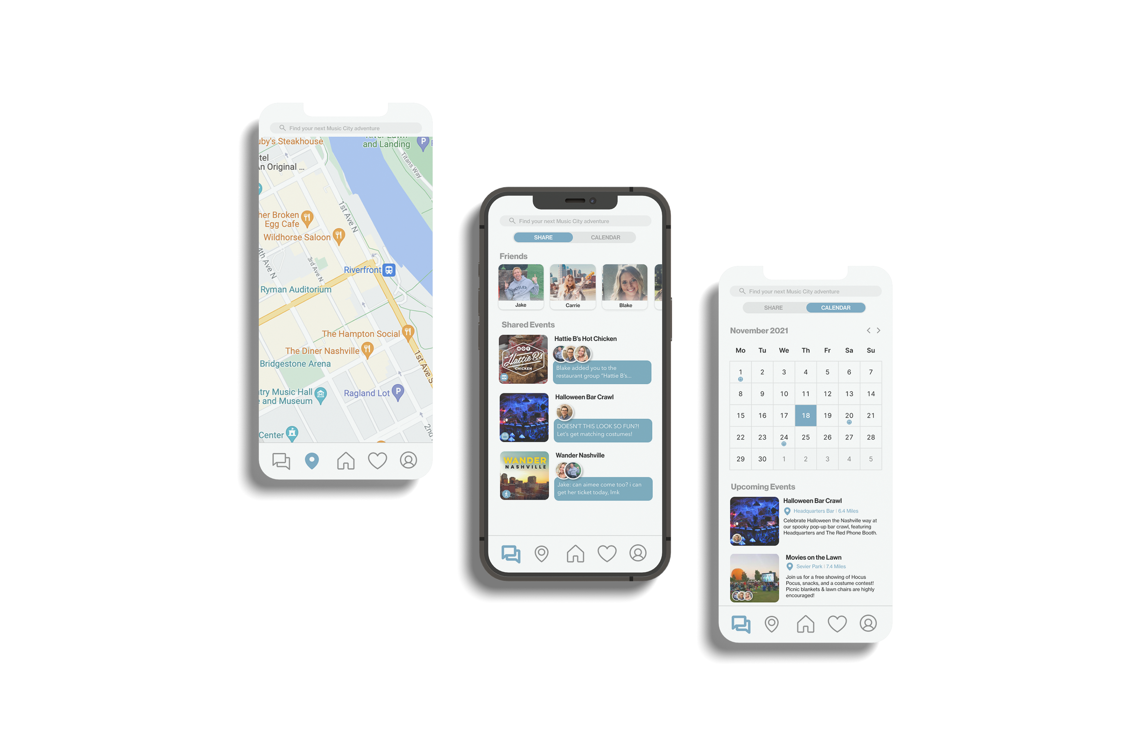
The map (left) utilizes Google Maps renders, based in users preferring a “familiar” experience when navigating. This also matches the map on the kiosk. The share page includes two parts: “Share” and “Calendar.” In the “Share” page (middle), users can begin individual and group messages surrounding upcoming events and locations. In the “Calendar” page (right), the users can view upcoming events—which include both favorited and shared events.
Interactive Systems
To interact with the designs, open the prototypes using the links below.